
You have humidity sensors in the crawlspace, smart plugs monitoring the washing machine, and a weather station on the roof. Your smart home is generating millions of data points, but right now, that data is likely trapped in a dozen different manufacturer apps or, worse, vanishing into the digital ether after 24 hours.
This is the current state of the Internet of Things (IoT) for many enthusiasts: rich in data, poor in insight.
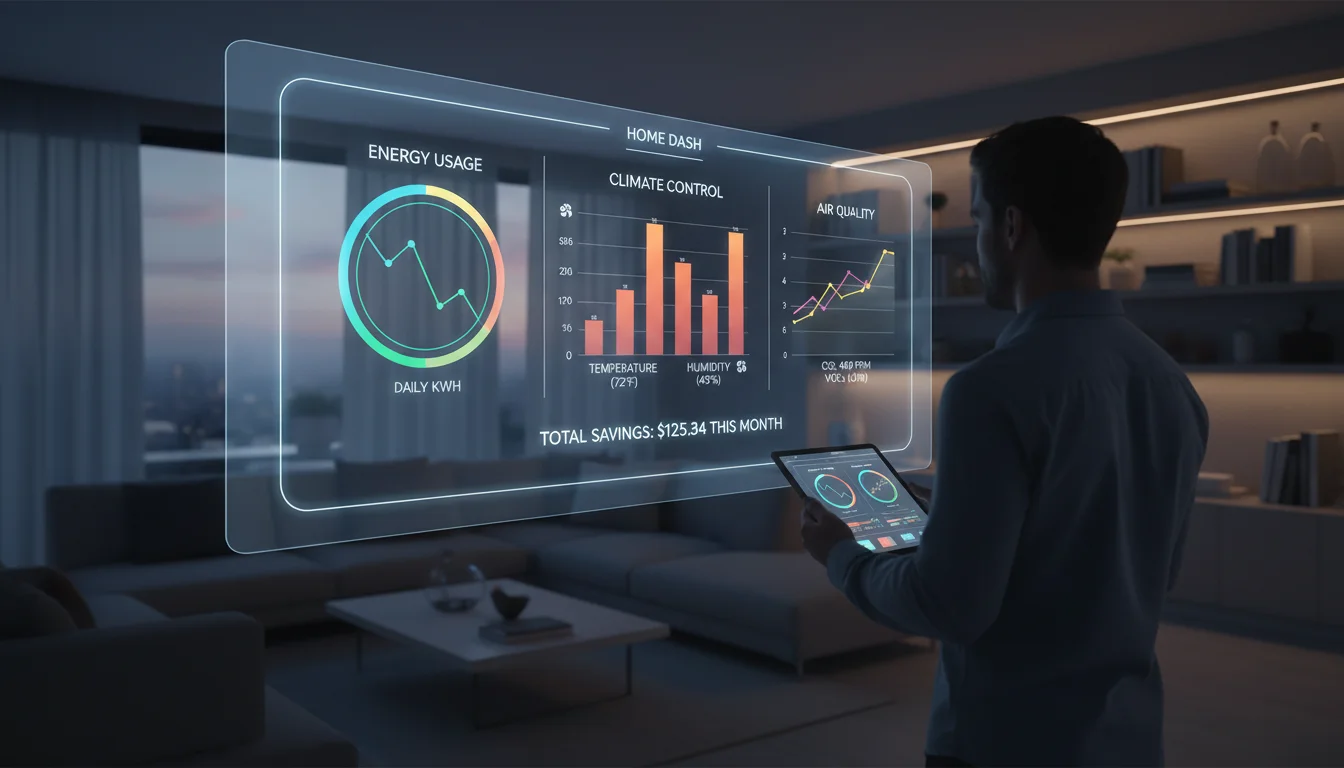
The solution isn’t buying more sensors; it is building a Smart Home Data Visualization Dashboard. A well-designed dashboard doesn’t just show you that the living room is 72°F; it tells you at a glance if your HVAC is running efficiently, if your energy bill is trending high, or if the humidity level is risking mold growth. More importantly, it organizes this chaos into a minimalist, ‘glanceable’ interface that even non-tech-savvy family members can appreciate.
In this guide, we will dismantle the complexity of IoT data visualization. We will explore how to aggregate your data, identify important tools and software features (from Home Assistant to Grafana), and design a UI that prioritizes clarity over sci-fi clutter.
The Anatomy of a Smart Home Dashboard
Before installing software, it is crucial to understand the two distinct types of visualization required for a robust smart home setup. Mixing these up is the primary reason why many dashboards look cluttered and confusing.
1. The Operational Dashboard (Real-Time)
This is your control center. It answers the question: “What is happening right now?”
- Goal: Immediate action and status checks.
- Data Retention: Low importance.
- Visuals: Toggle switches, gauge cards, conditional icons (e.g., a glowing trash can icon on trash day).
- Platform Leader: Home Assistant (Lovelace UI).
2. The Analytical Dashboard (Historical)
This is your insight engine. It answers the question: “How has my home performed over time?”
- Goal: Pattern recognition and optimization.
- Data Retention: High importance (months or years).
- Visuals: Time-series graphs, heatmaps, histograms.
- Platform Leader: Grafana connected to InfluxDB.
Choosing Your Visualization Stack
To visualize data, you need a pipeline. The industry standard for local, privacy-focused smart homes generally follows this flow: Sensor → MQTT Broker → Controller (Home Assistant) → Database → Visualization.
The All-in-One: Home Assistant + Mushroom Cards
For 90% of users, Home Assistant (HA) is the endgame. While HA used to be text-heavy, the introduction of the Lovelace UI and community projects like Mushroom Cards has revolutionized dashboard design. Mushroom cards allow for soft UI elements, rounded corners, and minimalist iconography that mimics high-end commercial software.
Pros: Integrated control (you can turn off the light you are looking at); massive community support; runs on a Raspberry Pi.
Cons: Long-term data graphing is basic out-of-the-box.
The Power User: Grafana + InfluxDB
If you want to visualize energy spikes down to the second or correlate outdoor temperature with indoor humidity over a year, you need Grafana. Grafana is an open-source analytics platform usually reserved for server monitoring, but it is perfect for IoT.
To use this, you install the InfluxDB add-on in Home Assistant. HA pushes the state changes to InfluxDB (a time-series database designed for high-volume writing), and Grafana reads from that database to create stunning, granular charts.
The Low-Code Alternative: Node-RED Dashboard
For those who build their automation logic in Node-RED, the native Dashboard 2.0 nodes offer a quick way to throw up gauges and charts. It is less polished than HA Lovelace but offers incredible flexibility for logic-based visualization (e.g., only showing a graph if a specific complex condition is met).
Design Principles for Minimalist IoT Dashboards
The trend in 2024 and beyond is Minimalism. Early smart home adopters built “spaceship” interfaces with hundreds of buttons. Today, the focus is on the WAF/PAF (Wife/Partner Acceptance Factor). If the dashboard is ugly or confusing, it won’t get used.
1. The 5-Second Rule
A user should be able to look at the dashboard and understand the home’s state within 5 seconds. If they have to scroll or decipher a legend, the design has failed.
2. Conditional Visibility
Don’t show a button for the Christmas tree lights in July. Don’t show the “Leak Detected” alert if everything is dry. Use conditional logic to hide elements when they aren’t relevant. A blank screen is better than a cluttered one filled with “Status: Idle” messages.
3. Hierarchy of Information
Group your data logically:
- Header: Critical alerts (Open garage door, water leak, high CO2).
- Body: Room-specific cards (Lighting, Climate, Media).
- Footer: System health (Server CPU, Disk space).
Top Metrics to Visualize for Maximum Impact
Once you have your stack, what should you actually display? Here are the high-value data points that justify the effort.
Energy Consumption & Solar Production
Using CT clamps (like Shelly EM or Emporia Vue) or reading smart meter data, you can visualize real-time wattage.
The Visualization: Use a “Gauge” for current usage and a “Bar Chart” for daily costs. Seeing a gauge turn red when the dryer and AC are running simultaneously is a powerful behavior changer.
Indoor Air Quality (IAQ)
With affordable sensors handling VOCs, CO2, and PM2.5, visualizing air quality is vital for health.
The Visualization: A simple color-coded badge. Green for <800ppm CO2, Yellow for 800-1200, Red for >1200. Graphing this over 24 hours can reveal ventilation issues in bedrooms.
Presence and Occupancy
Using mmWave sensors (like the Aqara FP2), you can now visualize exactly where people are in a room.
The Visualization: A floorplan map card. This is advanced, but overlaying active icons on a 3D render of your home is the pinnacle of smart home visualization.
Step-by-Step: Setting Up Your First Dashboard
Phase 1: Centralization
Install Home Assistant OS on a dedicated device (Raspberry Pi 4/5 or an Intel NUC). Use integrations to pull in your disparate devices (Tuya, Hue, Ecobee, etc.) so all entities exist in one registry.
Phase 2: Database Configuration
Install the InfluxDB add-on from the HA Supervisor store. Configure it to record specific domains (sensor, binary_sensor) and exclude high-noise entities (like uptime sensors) to save disk space.
Phase 3: The Front End
Start with the standard Lovelace UI. Install HACS (Home Assistant Community Store) and download “Mini Graph Card” and “Mushroom Cards.” Replace the default auto-generated view with a “Grid” layout card and start adding entities. Focus on one room at a time.
Frequently Asked Questions
Do I need to know how to code to build a dashboard?
No. Modern tools like Home Assistant offer a “Drag and Drop” editor for dashboards. However, knowing YAML (a human-readable data format) allows for much deeper customization and is highly recommended for advanced users.
Can I run this on an old tablet?
Absolutely. Wall-mounting an old iPad or Fire Tablet running the “Fully Kiosk Browser” app is a classic move. It turns an unused device into a dedicated smart home control panel.
Is cloud data visualization secure?
Cloud dashboards (like Alexa or Google Home) are easy but carry privacy risks. The local stack described here (Home Assistant + Grafana) keeps all your data within your home network, ensuring that your habits and video feeds remain private.
Why is my dashboard lagging?
Lag is usually caused by the database or the hardware. If you are logging every sensor change every second to an SD card on a Raspberry Pi, it will slow down. Moving to an SSD and optimizing your recorder settings (using commit_interval) usually solves this.
Conclusion
Building a smart home data visualization dashboard is the bridge between having a house full of gadgets and having a truly smart home. It transforms invisible data into visible insights, helping you save energy, improve comfort, and simply enjoy the technology you’ve invested in.
Start small. Don’t try to graph the voltage fluctuation of every smart bulb on day one. Build a clean, operational dashboard for your daily needs, and then deploy a separate Grafana instance for your deep dives. The goal is not just to see the data, but to understand your life better through it.