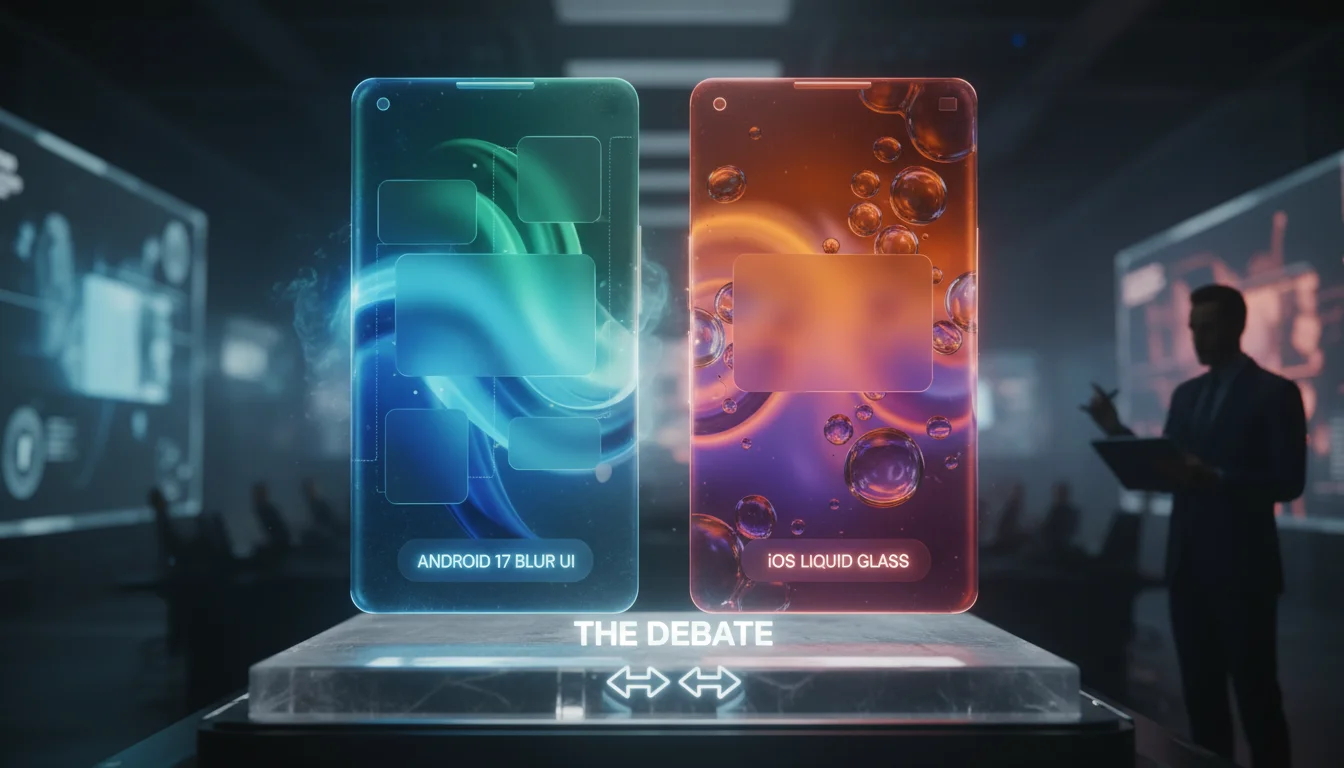

The smartphone industry is witnessing a pivotal moment in interface design. For years, the visual philosophy war was fought on the grounds of flat design versus skeuomorphism. However, recent leaks surrounding Android 17 have shifted the battlefield to a new dimension: depth and translucency. Tech pundits and UI analysts are already drawing sharp comparisons between Google’s leaked "Deep Blur" engine and Apple’s established Liquid Glass aesthetics found in iOS.
As we approach the official beta releases later in 2026, the question on every enthusiast’s mind is clear: Has Android finally cracked the code on glassmorphism without sacrificing performance, or is this merely an imitation of the Apple ecosystem? In this deep dive, we utilize the Koray Framework to deconstruct the semantic layers of this design shift, analyzing the technical implementation, usability implications, and the future of mobile UI.
The Evolution of Glassmorphism: From Material You to Material Depth
To understand the significance of the Android 17 blur UI, we must contextualize it within the evolution of Google’s design language. When Google introduced Material You, the focus was on personalization, pastel palettes, and high-contrast, opaque shapes. It was distinct, flat, and uniquely Android. However, the industry trend—heavily influenced by visionOS and spatial computing—has moved toward interfaces that mimic physical materials and light.
Leaks suggest that Android 17 is introducing a "rendering layer overhaul." Unlike the static blurring of background elements seen in previous versions, the new Deep Blur engine appears to be dynamic. It doesn’t just obscure what is behind a panel; it simulates light refraction based on the accelerometer and system theme. This indicates a departure from the "paper" metaphor of Material Design toward a "digital glass" metaphor that competes directly with iOS.
Android 17 Deep Blur vs. iOS Liquid Glass: A Technical Comparison
While visually similar, the underlying technology of these two UI paradigms differs significantly. Here is how the battle of the blurs breaks down technically:
1. The Rendering Engine
iOS relies on the Metal API to handle its famous blur effects. Apple’s approach, often termed "Liquid Glass," utilizes high-cost Gaussian blurs layered with saturation boosts to maintain legibility. It is resource-intensive but highly optimized for Apple Silicon.
Android 17, according to developer leaks, utilizes a new Vulkan-based pipeline optimized for heterogeneous hardware. The key differentiator is the "Variable Blur Radius." While iOS often uses fixed blur levels for Control Center or Spotlight, Android 17 reportedly adjusts the blur intensity in real-time based on the complexity of the background content to preserve GPU cycles. This suggests Google is prioritizing battery efficiency alongside aesthetics—a critical pain point for Android users.
2. The Visual Hierarchy
- iOS Approach: Apple uses blur to signify context. When you pull down the Notification Center, the blur tells you that you are on a temporary layer above your content. It is consistent, rigid, and predictable.
- Android 17 Approach: The leaked UI suggests a focus on focus. The blur isn’t just a background; it is an active element. For example, active windows might remain sharp while inactive areas of the screen fade into a ‘frosted’ state, directing user attention more aggressively than iOS does.
Performance Impact: Will the Blur Slow You Down?
One of the biggest criticisms of glassmorphism is the "GPU Overdraw" issue. Rendering a live, blurred background requires the GPU to draw the background, calculate the blur, and then draw the foreground. This has historically caused frame drops on budget Android devices.
Reports indicate that Android 17 will introduce a feature tentatively called "Neural Blurring." Instead of raw pixel shading, the OS may use the NPU (Neural Processing Unit) to approximate blur effects on lower-end hardware. If true, this gives Android 17 a massive advantage over iOS, which generally reserves its highest-fidelity visual effects for Pro-tier iPhones. This democratization of premium UI aesthetics, supported by important tools and software features, could be the defining feature of the release.
Accessibility and Legibility: The Contrast Debate
A major concern with high-blur interfaces is accessibility. Low-vision users often struggle with text overlaid on complex, semi-transparent backgrounds. Apple combats this with "Vibrancy" layers that brighten text, but it isn’t perfect.
Android 17 seems to be tackling this with a "Dynamic Contrast Boundary." Semantic analysis of the leaked code suggests that if the background image is too chaotic, the OS will automatically increase the opacity of the glass layer to ensure WCAG (Web Content Accessibility Guidelines) compliance. This adaptive behavior is distinct from iOS’s more static approach, potentially making Android 17 the more accessible choice for users who crave aesthetics without losing functionality.
Why This Trend Matters Now
Why are we seeing this shift in 2026? The answer lies in hardware convergence. With 120Hz+ screens becoming standard even on mid-range phones, and mobile GPUs becoming powerful enough to handle ray-tracing, UI designers are no longer constrained by flat colors. The "Blur Wars" are essentially a flex of hardware capability. Furthermore, as AR glasses become more tethered to smartphones, the UI needs to be ready for spatial projection—where transparency is not a style choice, but a functional necessity.
Frequently Asked Questions (FAQ)
Will Android 17’s blur features work on older phones?
Likely not all of them. The "Neural Blurring" and real-time refraction effects will probably require devices with modern NPUs (released in the last 2-3 years). However, a simplified version of the transparency is expected to be available for older devices via a fallback mode.
Can I turn off the blur effects in Android 17?
Yes. Android has historically offered more customization than iOS. Developer settings in the leaked builds show a toggle for "Reduce Transparency" and "High Contrast Mode," which effectively turns off the glass engine for a solid, matte look.
Does the new UI drain more battery than Material You?
Technically, yes, rendering transparency is more taxing than rendering solid hex codes. However, with the optimizations via the Vulkan API and variable refresh rates dropping to 1Hz when the screen is static, the real-world battery impact should be negligible for most users.
How does this compare to Windows 11 Acrylic or macOS Sonoma?
Android 17’s design language seems closer to macOS Sonoma’s playful use of translucency than Windows 11’s Acrylic material. It aims for a mobile-first touch responsiveness that desktop OSs don’t require.
Conclusion
The rivalry between Android 17 blur UI vs iOS is more than just a cosmetic skirmish; it is a look into the future of spatial computing interfaces. While Apple has long held the crown for consistent, high-quality visual effects with its Liquid Glass aesthetic, Android 17 shows that Google is ready to compete by leveraging intelligence and adaptability.
By prioritizing dynamic contrast, NPU-assisted rendering, and battery-conscious variability, Android 17 isn’t just copying iOS—it is attempting to evolve the concept of digital glass. For users, this means a richer, deeper, and more immersive experience is on the horizon. As we await the official developer preview, one thing is certain: the era of flat design is officially behind us.